Waha: brand identity
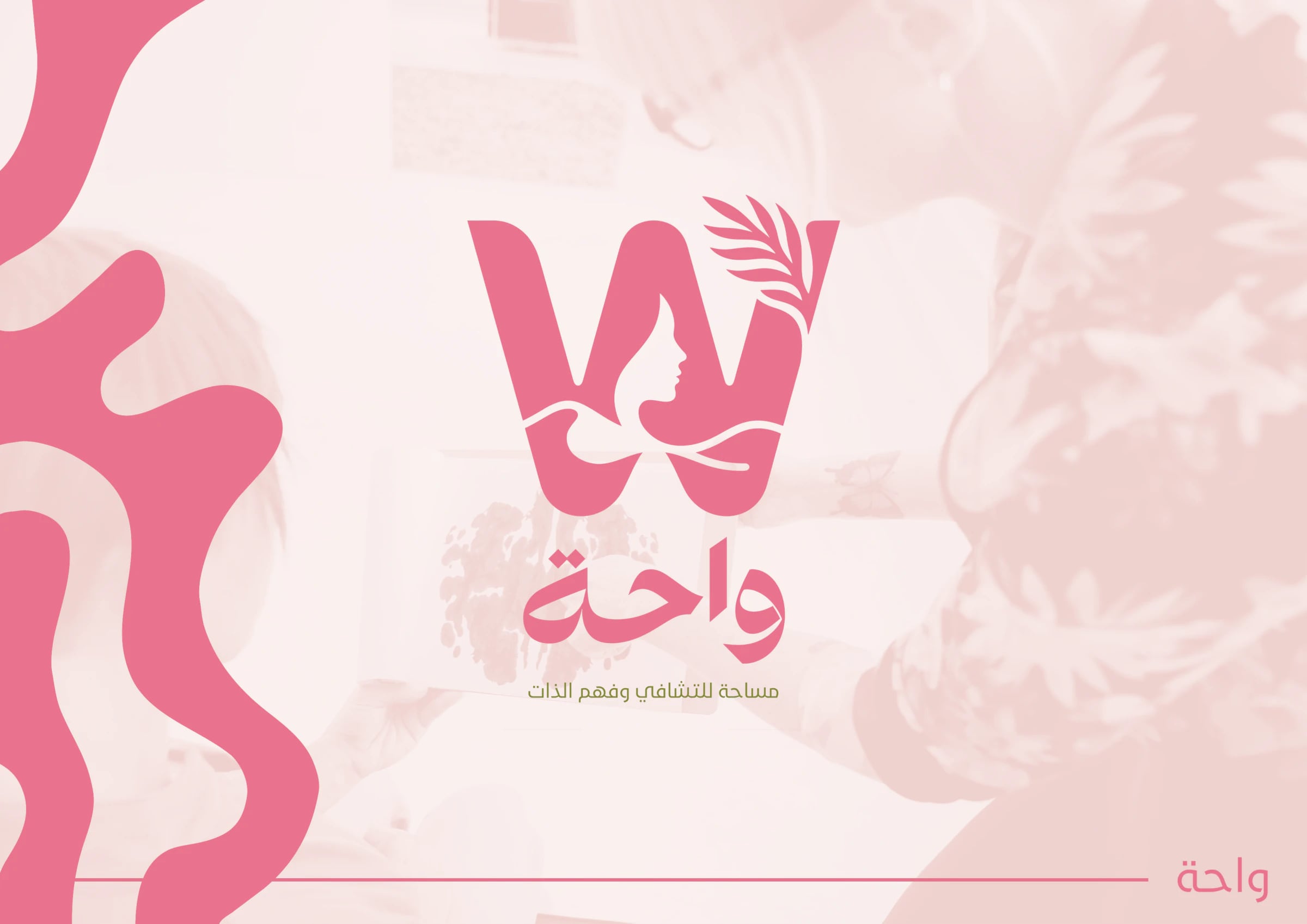
Brand identity for Waha, a space for healing and self-understanding: a W that joins a woman's face and a leaf, soft colours and organic patterns.
Overview
A brand identity for Waha, which presents itself as a space for healing and self-understanding.
Concept
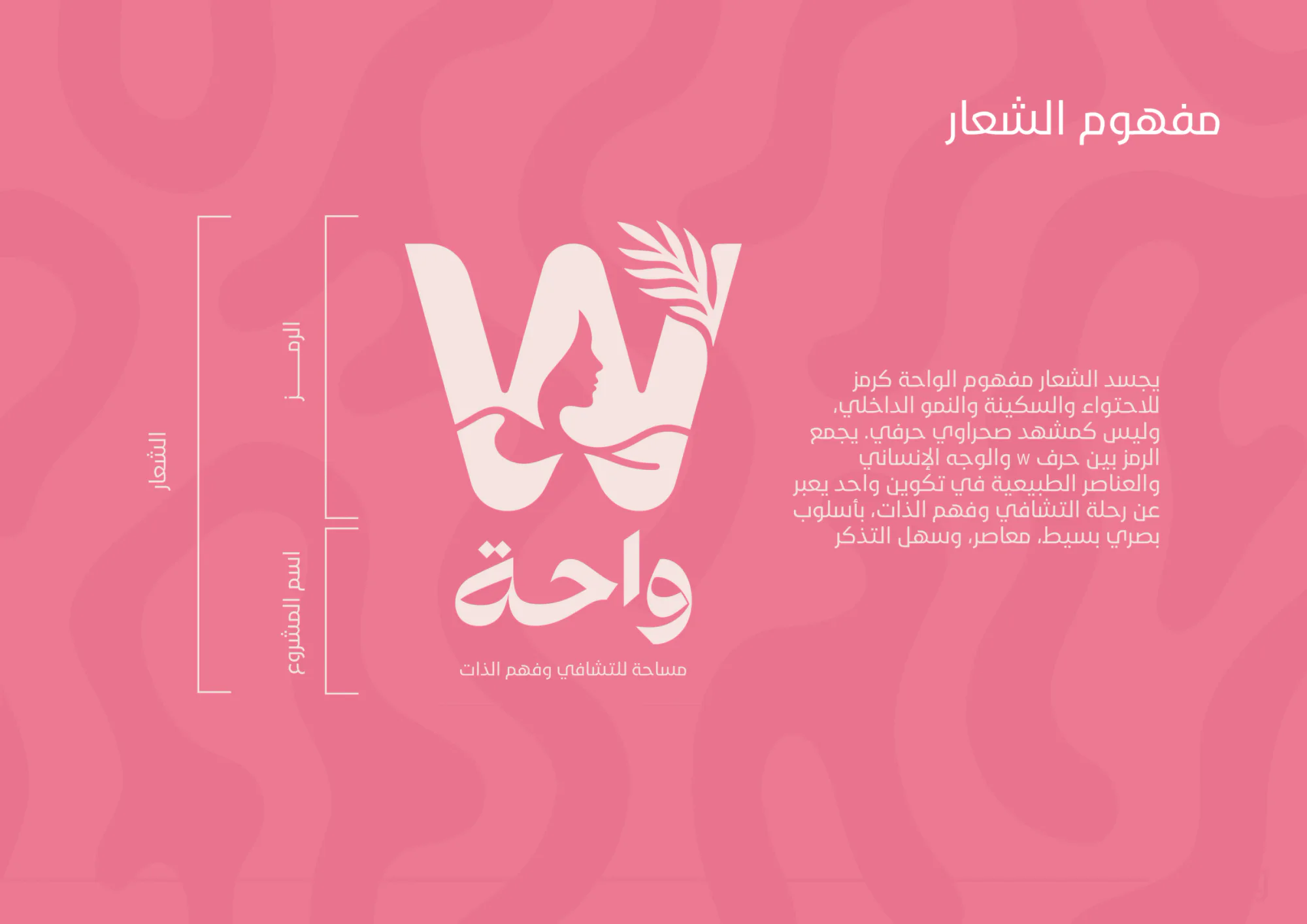
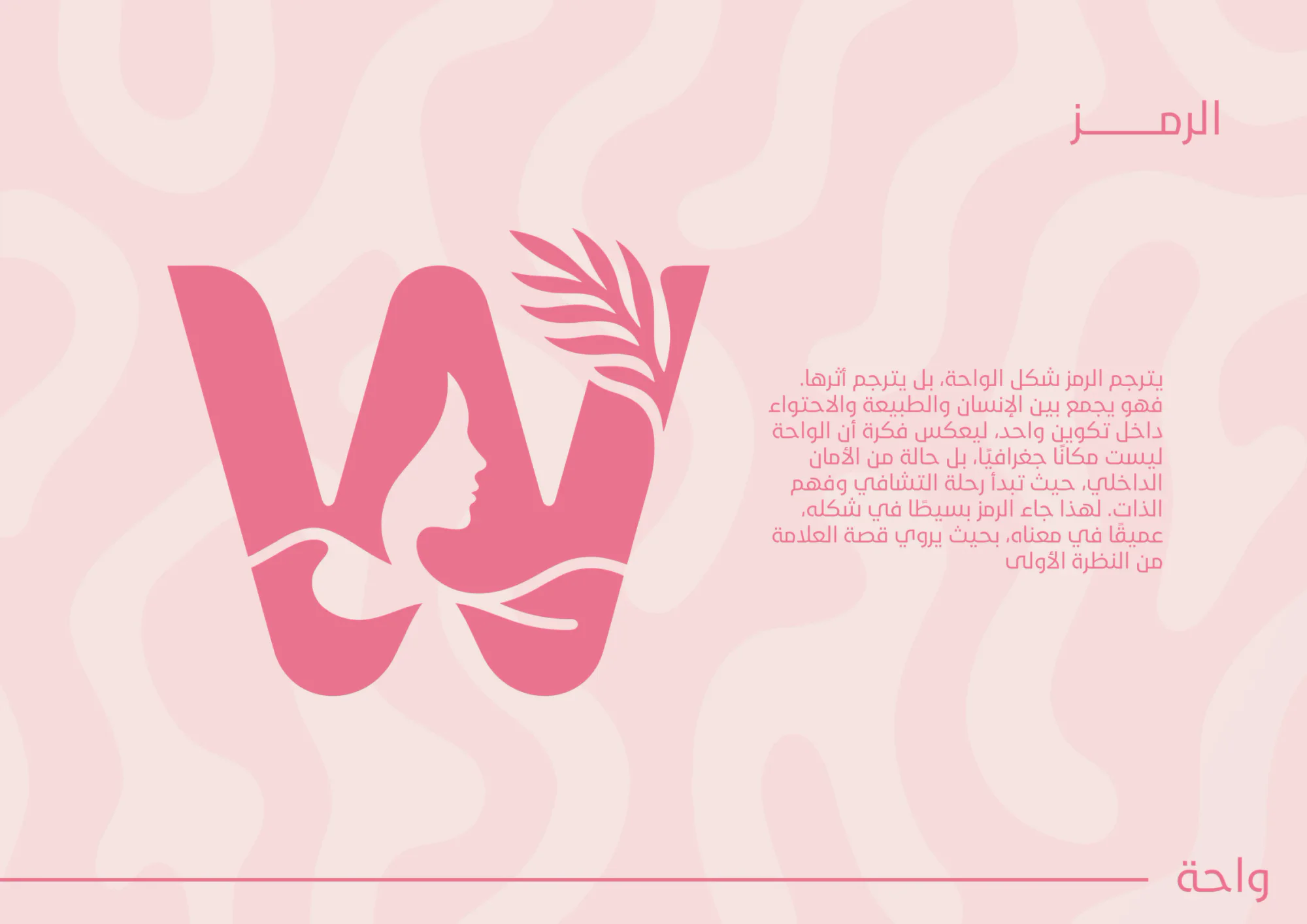
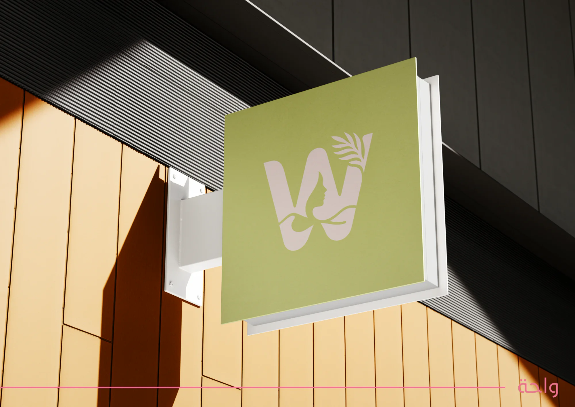
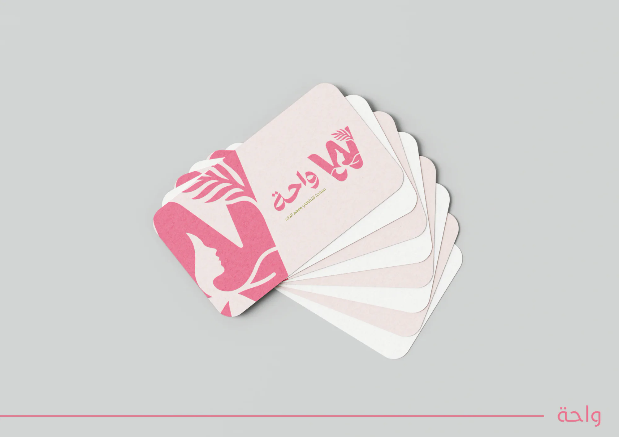
The logo treats the oasis as a symbol of shelter, calm and inner growth rather than as a desert scene. The mark joins the letter W, a woman’s face and natural elements in one form, to tell the brand’s story of healing and self-understanding at a glance.
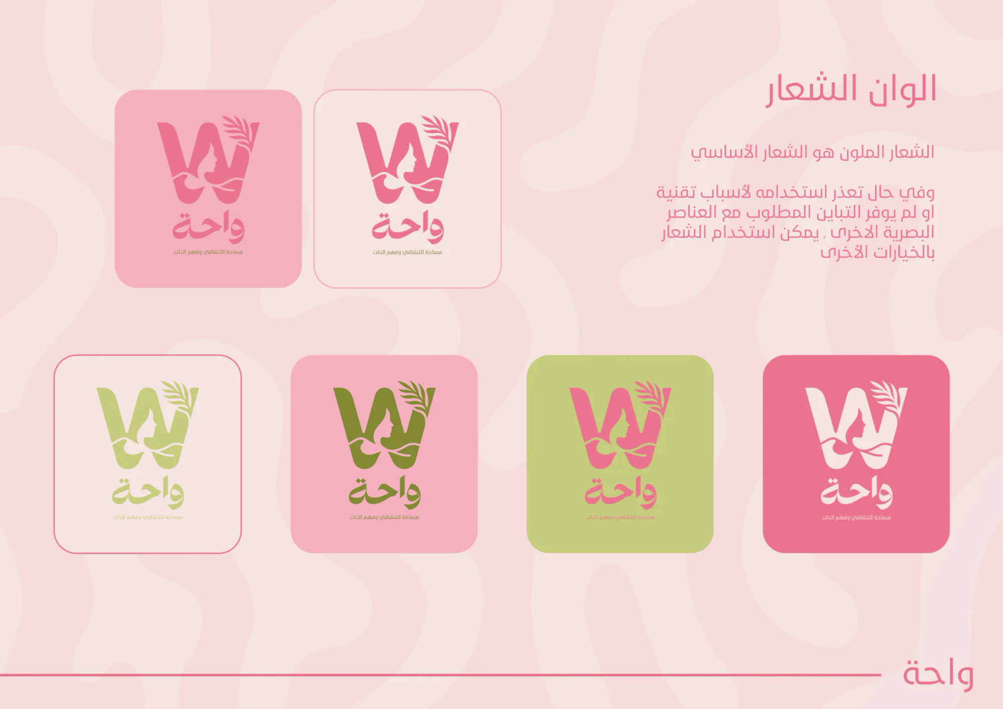
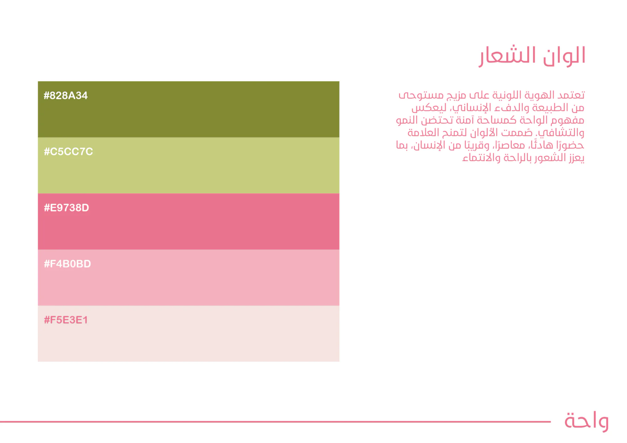
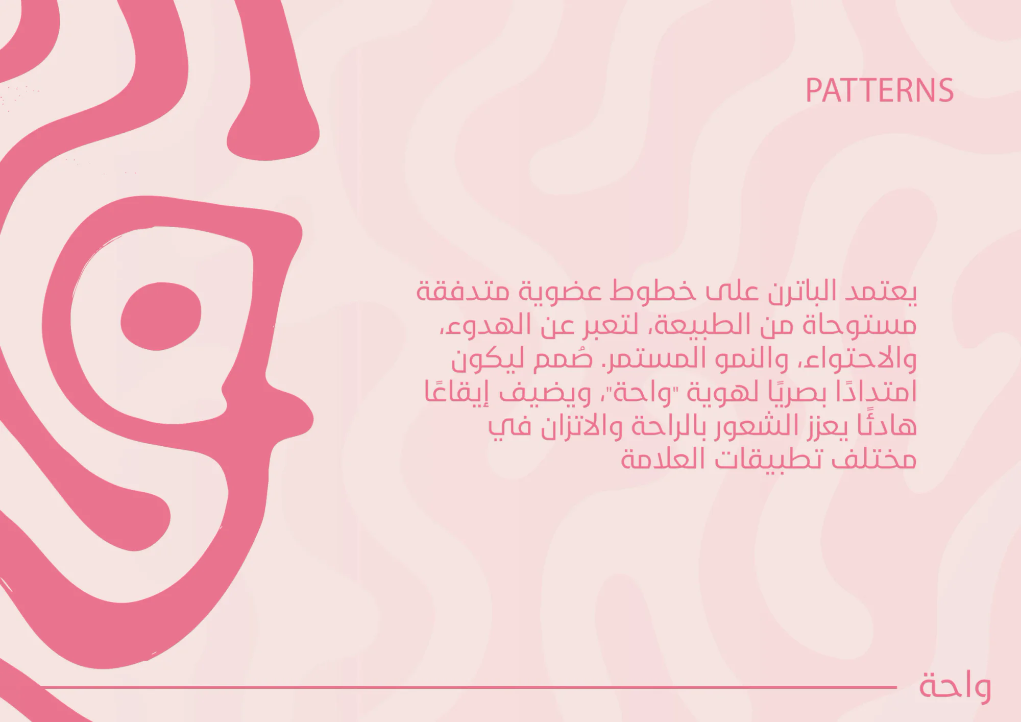
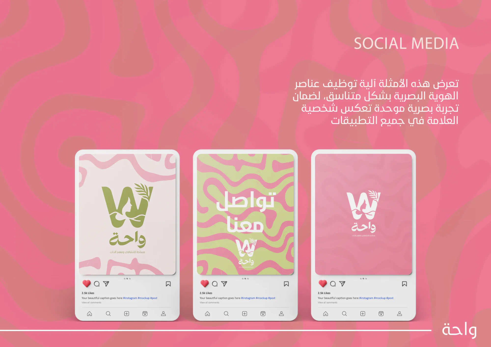
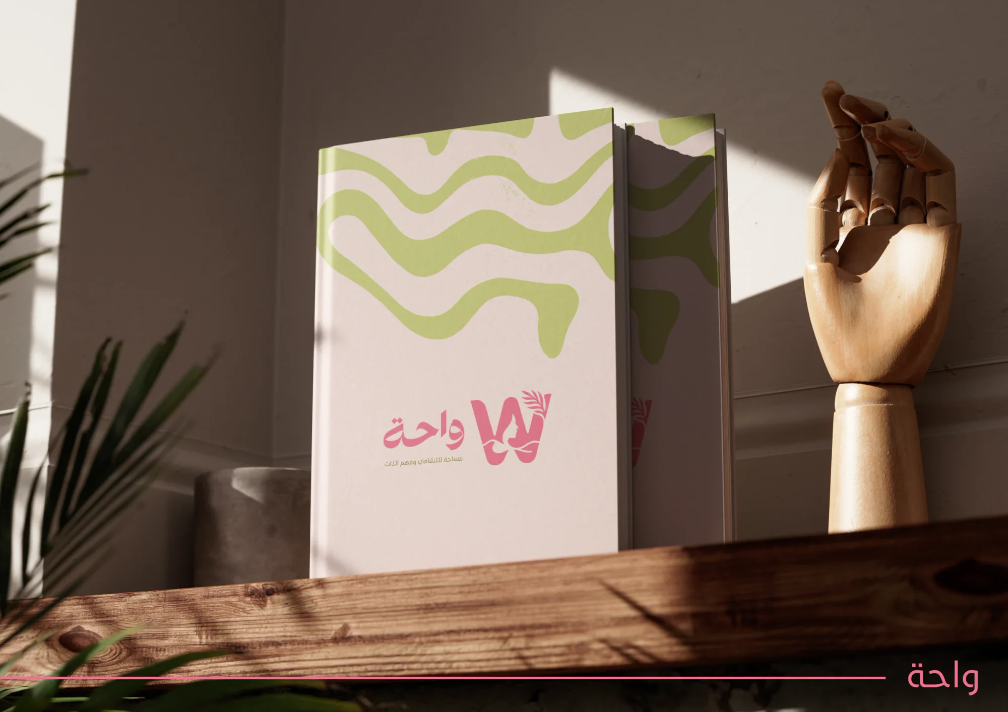
The palette mixes greens and pinks drawn from nature and human warmth. Flowing organic lines form the pattern that carries the identity across print and social media. The full-colour logo is the primary version, with alternatives for backgrounds where it lacks contrast.
In this selection
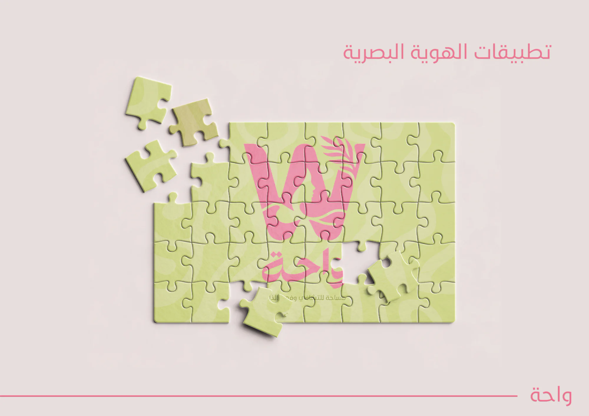
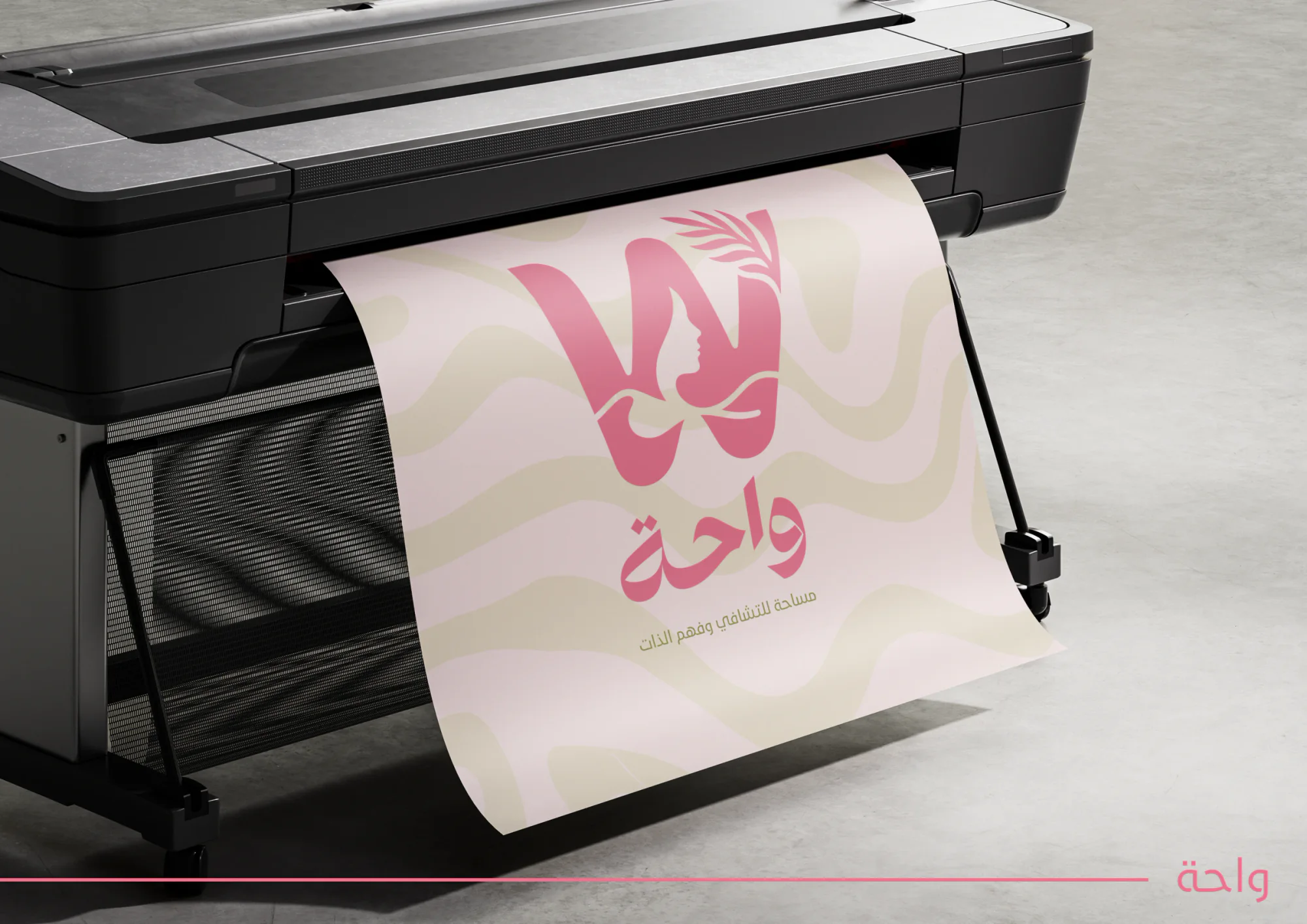
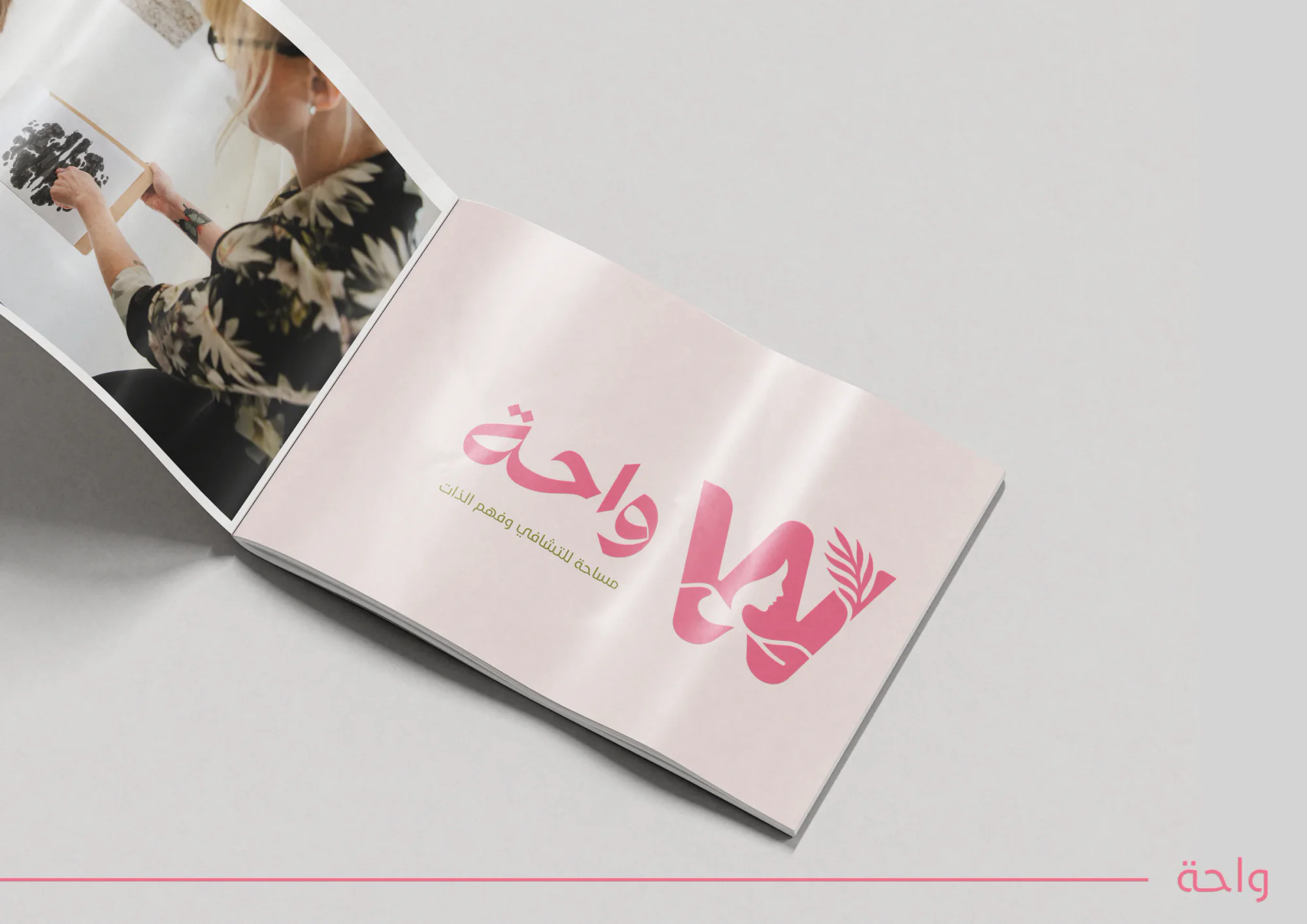
The concept and symbol pages, the logo colours and palette, the pattern, social media posts, and the identity on a jigsaw, a large-format print, a book cover, a hanging sign, cards and a brochure.